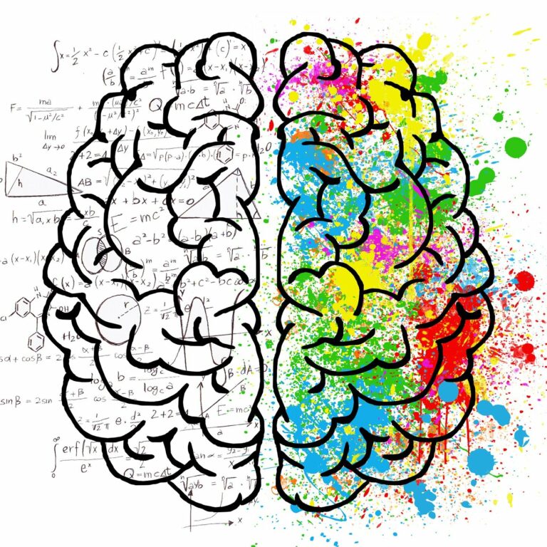
Have you ever walked into a store and felt an immediate sense of calm and peace? Or perhaps a website’s vibrant colors energized you to explore further? Colors aren’t just visual; they have a profound psychological impact, influencing our emotions, behaviors, and even decisions. As a graphic designer, understanding color psychology is essential for crafting designs that resonate with your target audience and achieve your desired goals.
In this blog, Toon2 – The Animation & Multimedia School in Mysore, dives deep into the fascinating world of color psychology and its application in design. We’ll explore how different colors evoke specific emotions, how cultural influences shape color perception, and most importantly, how you can leverage this knowledge to create impactful designs.
Why Color Psychology Matters in Design
Color is one of the first things people notice about a design. It sets the tone, grabs attention, and influences how viewers perceive the information presented. By understanding how colors affect us, designers can make strategic choices to evoke specific emotions, guide user behavior, and create a memorable brand identity.
For example, a website selling children’s toys might use playful and bright colors like yellow, orange, and green to create a sense of fun and excitement. Conversely, a financial services company might utilize more subdued colors like blue and navy to convey trust, stability, and professionalism.
The Emotional Spectrum of Colors
Let’s delve into the psychology behind some of the most common colors:
- Red: Red is a stimulating color associated with passion, excitement, and urgency. It can grab attention and create a sense of action. However, overusing red can evoke feelings of anger or danger.

- Blue: Blue is a calming and trustworthy color often linked to peace, security, and intelligence. It’s a popular choice for websites promoting professional services or products related to relaxation.

- Yellow: Yellow is a cheerful and optimistic color associated with happiness, energy, and creativity. It can be used to add warmth and friendliness to a design. However, too much yellow can be overwhelming.

- Green: Green evokes feelings of nature, growth, and harmony. It represents balance and can create a sense of peace and tranquility. Green is also often associated with health and eco-friendliness.

- Black: Black is a color of power, sophistication, and elegance. It can also be associated with mystery or luxury. However, using too much black can make a design feel heavy or depressing.

- White: White represents purity, cleanliness, and simplicity. It creates a sense of openness and can be used to make a design feel more spacious. However, excessive white can feel sterile or cold.

Cultural Considerations in Color Psychology
It’s important to remember that color perception can vary across cultures. For instance, red might symbolize good luck in China but danger in some Western countries. When designing for a global audience, it’s crucial to research cultural associations with colors to avoid unintentional misinterpretations.
Putting Color Psychology into Practice
Now that you understand the power of color psychology, here are some tips for using it effectively in your designs:
- Define your target audience: Who are you designing for? Understanding their demographics, preferences, and emotions will guide your color choices.
- Set design goals: What do you want your design to achieve? Do you want to evoke a specific emotion, encourage a particular action, or create a sense of brand identity?
- Choose a Color Palette: Based on your target audience and design goals, select a limited color palette of 2-3 main colors and a couple of accent colors. This creates a cohesive and visually appealing design. Consider using color theory tools like complementary colors (opposites on the color wheel) or analogous colors (neighbors on the color wheel) to create harmony.
- Utilize Color Hierarchy: Establish a dominant color to draw attention to the most important elements of your design. Lighter or muted colors can be used for backgrounds or less important information.
- Consider Color Combinations: Some color combinations evoke specific feelings. For example, red and yellow can create a sense of urgency, while blue and green promote a sense of calmness. Experiment with different combinations to achieve the desired effect.
- Test and Refine: Don’t be afraid to experiment! Get feedback on your color choices from your target audience or colleagues. There’s no one-size-fits-all approach, and what works for one design might not work for another.
Beyond the Basics: Advanced Color Psychology Techniques
- Color Temperature: Colors can be perceived as warm (reds, oranges, yellows) or cool (blues, greens, purples). Warm colors create a sense of energy and excitement, while cool colors promote calmness and relaxation. Use color temperature strategically to influence the mood of your design.
- Color Saturation: Saturation refers to the intensity of a color. Highly saturated colors are bold and eye-catching, while desaturated colors are more muted and subtle. Use saturated colors sparingly to draw attention, and desaturated colors for backgrounds or to create a more sophisticated look.
- Psychology of Texture: The way a color is textured can also impact its perception. For example, a rough red texture might feel more aggressive than a smooth red texture. Consider how the texture of your design elements interacts with the chosen colors.
Conclusion
By harnessing the power of color psychology, you can create designs that resonate with your audience and achieve your desired goals. Toon2, the premier Animation & Multimedia School in Mysore, encourages you to experiment with color and explore its vast potential to elevate your design projects. Remember, understanding the emotional impact of colors can be a game-changer in the world of design!
Ready to transform your design skills and become a master of color? Toon2’s Graphic Design Course equips you with the knowledge and practical experience to create visually stunning and emotionally impactful designs. Our comprehensive curriculum covers color theory, color psychology, typography, layout principles, and industry-standard design software. Learn from experienced professionals, build a strong portfolio, and take your creative vision to the next level. Enroll in our Graphic Design Course today!

